By the end of this chapter, you will be familiar with:
- Sample, random sample, frequency distribution and continuous data
- Sampling
- Frequency tables, box-and-whisker plots
- Histograms and interval variations
- Mean, median, mode, quartiles and percentiles
- Range, interquartile range, variance and standard deviation
- Cumulative frequency graph analysis
- Linear correlation bivariate data
- Linear regression
INTRODUCTION
Basic definitions:
- Statistics deals with data collection, organization, analysis, interpretation and presentation.
- Sampling is the selection of a subset (a statistical sample) of individuals from within a statistical population to estimate characteristics of the whole population.
- A population may refer to an entire group of people, objects, events, hospital visits, or measurements. A population can thus be said to be an aggregate observation of subjects grouped together by a common feature.
- For each population there are many possible samples.
- A variable is any characteristics, number, or quantity that can be measured or counted. and might vary over time. A variable may also be called a data item.
- While collecting data, reliability (or reproducibility) is consistency across time (test-retest reliability) and validity is the extent to which the scores actually represent the variable they are intended to.
GRAPHICAL TOOLS
CLASSIFICATION OF VARIABLES
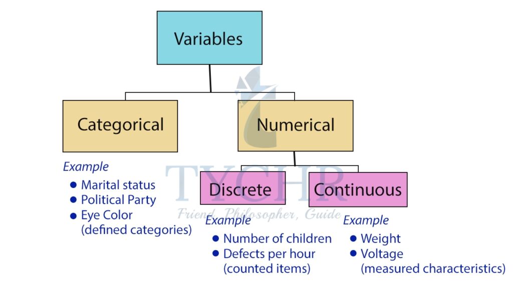
Data/variables can be classified into two main types- numerical (quantitative) and categorical (qualitative) data.
Numerical data
Numerical or quantitative data measures a numerical quantity.
There are two types of numerical data:
- Discrete data represent items that can be counted; they take on possible values that can be listed out.
Ex. The result of rolling a dice (1,2,3,4,5,6) - Continuous data represent measurements; their possible values cannot be counted and can only be described using intervals on the real number line.
Continuous data can also be described using ratio variables.
Ex. The time it takes for a student to travel to school.
Categorical or Qualitative data
It measure a quality or characteristic of the experimental unit. Categorical data represent characteristics such as a person’s gender, marital status, hometown, or the types of movies they like.
We often use a pie-chart to display different values of a given variable.
It shows how a total amount is divided between levels of a categorical variable as a circle divided into radial slices. Each categorical value corresponds with a single slice of the circle, and the size of each slice (both in area and arc length) indicates what proportion of the whole each category level takes.
Ex. Favorite type of movies: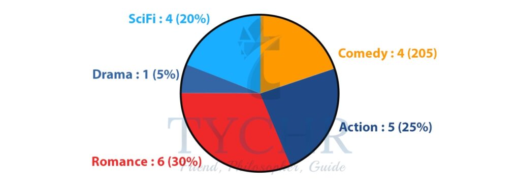
FREQUENCY DISTRIBUTIONS
A frequency distribution table is one way you can organize data so that it makes more sense.
The frequency of an observation tells you the number of times the observation occurs in the data. For example, in the following list of numbers, the frequency of the number 9 is 5 (because it occurs 5 times):
1, 2, 3, 4, 6, 9, 9, 8, 5, 1, 1, 9, 9, 0, 6, 9.
In a frequency distribution table, the left column, called classes or groups, includes numerical intervals on the variable being studied. The right column is a list of the frequencies or number of observations, for each class.
Taking an example on how to generate a frequency distribution table:
Ex. The data below shows the mass of 40 students in a class. The measurement is to the nearest kg. Draw a frquency distribution table for the same.
55, 70, 57, 73, 55, 59, 64, 72, 60, 48, 58, 54, 69, 51, 63, 78, 75, 64, 65, 57, 71, 78, 76, 62, 49, 66, 62, 76, 61, 63, 63, 76, 52, 76, 71, 61, 53, 56, 67, 71
STEP 1- Check for the minimum and maximum value. Here 48 is the minimum and 78 is themaximum.
STEP 2-Find the range. Here, the range is 78-48=30. The scale of the frequency table must contain the range of the masses.
STEP 3- Decide the intervals for the distribution. Here we can use interval of 5 starting from 45 and ending at 79.
STEP 4- Draw the frequency table using the selected scale and intervals.
MASS (kg) | FREQUENCY |
45-49 | 2 |
50-54 | 4 |
55-59 | 7 |
60-64 | 10 |
65-69 | 4 |
70-74 | 6 |
75-79 | 7 |
BAR CHARTS AND HISTOGRAMS
We are familiar with bar charts. A histogram looks similar to a bar chart. Bar charts are suitable for discrete data, while a histogram is used for continuous data.
We can convert a frequency distribution into a histogram. The intervals are the x-axis variables and the frequencies are the y-axis variables. We construct bars for each interval without any space between them. The width of each bar spans the width of the data class it represents.
Generating a histogram for the example worked out for frequency distributions.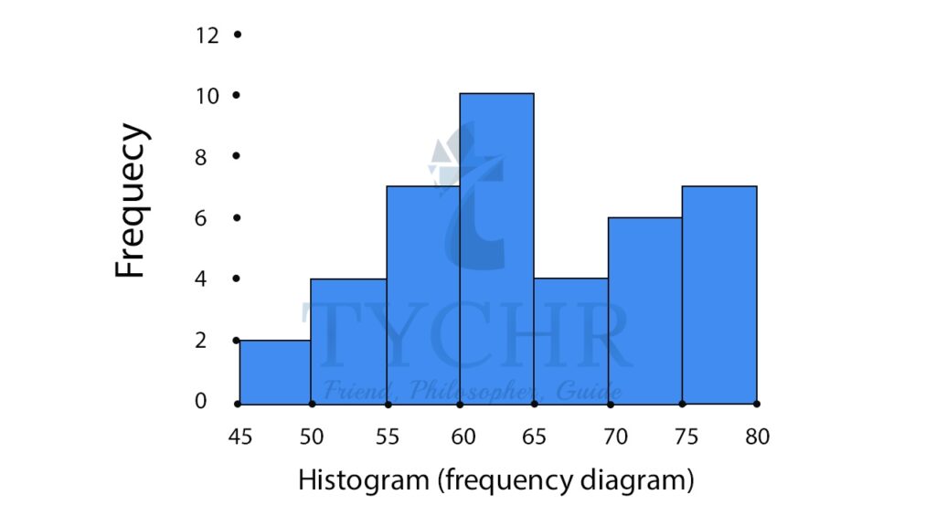
CUMULATIVE AND RELATIVE CUMULATIVE FREQUENCY DISTRIBUTIONS
The cumulative frequency is calculated by adding each frequency from a frequency distribution table to the sum of its predecessors. The last value will always be equal to the total for all observations, since all frequencies will already have been added to the previous total.
A relative cumulative frequency distributions converts all cumulative frequencies to cumulative percentages.
Adding the column of cummulative and relative cummulative frequency, in the example we worked out for frequency distribution.
MASS (kg) | FREQUENCY | CUMULATIVE FREQUENCY | PERCENTAGE OF MASS | CUMULATIVE PERCENTAGE OF MASS |
45-49 | 2 | 2 | 5 | 5 |
50-54 | 4 | 6 | 10 | 15 |
55-59 | 7 | 13 | 17.5 | 32.5 |
60-64 | 10 | 23 | 25 | 57.5 |
65-69 | 4 | 27 | 10 | 67.5 |
70-74 | 6 | 33 | 15 | 82.5 |
75-79 | 7 | 40 | 17.5 | 100 |
TOTAL | 40 | 100.0 |
Cumulative frequencies and their graphs help in analysing data given in group form.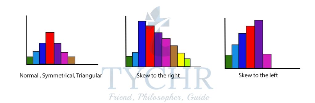
CUMULATIVE FREQUENCY GRAPHS (OGIVE)
Cumulative frequency graph is a line graph. The upper limit of each class is the x-axis variable and the cumulative frequency is the y-axis variable.
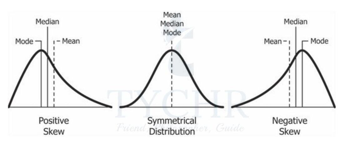
SHAPE OF DISTRIBUTION
Note the following shapes of distribution, symmetric and skewed
- The 2nd distribution is also called positively skewed distribution.
- The 3rd distribution is also called negatively skewed distribution.
SAMPLING
The population consists of every member in the group that you want to find out about. A sample is a subset of the population that will give you information about the population as a whole.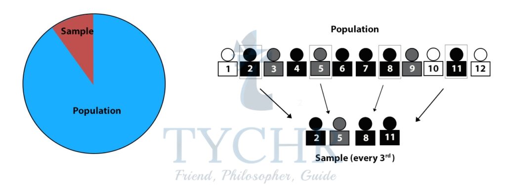
There are a number of ways in which we can draw a sample from the population. We should always try to choose a method which results in the sample giving the best approximation for the population as a whole.
When surveying, however, it is vital to ensure the people in your sample reflect the population or else you will get misleading results.
1.) REASONS FOR SAMPLING
- To bring the population to a manageable number
- To reduce cost
- To help in minimizing error from the despondence due to large number in the population
- Sampling helps the researcher to meetup with the challenge of time.
TYPES OF SAMPLING
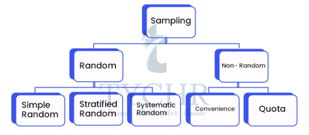
a) Random sampling
Random sampling is a part of the sampling technique in which each sample has an equal probability of being chosen. It is also called probablity sampling.
- Simple random sampling- Each member of the population has an equal chance of being selected.
Ex. Names of 25 employees being chosen out of a hat from a company of 250 employees. - Stratified random sampling-This involves dividing the population into smaller groups known as strata. The strata are formed based on members’ shared characteristics.
Ex. For example, one might divide a sample of adults into subgroups by age, like 18–29, 30–39, 40–49, 50–59, and 60 and above. To stratify this sample, the researcher would then randomly select proportional amounts of people from each age group. - Systematic random sampling- Here, you list the members of the population and select a sample according to a random starting point and a fixed interval.
Ex. Lucas can give a survey to every fourth customer that comes in to the movie theater.
b) Non-random sampling
Non-random sampling is a way of selecting units based on factors other than random chance. Here, not every unit of the population has the same probablity of being selected into the sample. It is also called non-probablity sampling.
- Convenience sampling- Convenience sampling is a method that relies on data collection from population members who are conveniently available to participate in study.
Ex. One could survey people from:- Workplace,
- School
- A club one belongs to
- The local mall.
- Quota sampling-This is like stratified sampling, but involves taking a sample size from each stratum which is in proportion to the size of the stratum.
Ex. In a company of 1000 employees where 60% of the employees are female and 40% are male, your sample should also be 60% female and 40% male.
MEASURES OF CENTRAL TENDENCY
A measure of central tendency is a summary statistic that represents the center point or typical value of a dataset. These measures indicate where most values in a distribution fall and are also referred to as the central location of a distribution.
The three most common measures of central tendency are the mean, median, and mode.
- MEAN
The mean is the arithmetic average. Calculating the mean is very simple. You just add up all of the values and divide by the number of observations in your dataset.
Mean = 𝒔𝒖𝒎 𝒐𝒇 𝒅𝒂𝒕𝒂/𝒏𝒖𝒎𝒃𝒆𝒓 𝒐𝒇 𝒅𝒂𝒕𝒂
Ex. Find the mean of the following numbers: 19, 8, 17, 10, 11
Mean = (19+8+17+10+11)/5 = 13 - MODE
The mode is the value that occurs most frequently in a set of data. On a bar chart, the mode is the highest bar. If the data have multiple values that are tied for occurring the most frequently, you have a multimodal distribution. If no value repeats, the data do not have a mode.
When asked for the mode of grouped data, you should state the group that has the highest frequency. This is called the modal class.
Ex. Find the mode of the following numbers: 1, 2, 2, 3, 5, 2, 1, 3, 5, 2
2 is repeated the most.
Mode =2 - MEDIAN
The median is the middle data value when the data values are arranged in order of size. If the number of values in a data set is even, then the median is the mean of the two middle numbers.
Ex. Find the median of 7, 12, 1, 4, 2, 17, 9, 11, 16, 10, 18
Arrange the data in order of size- 1, 2, 4, 7, 9, 10, 1 1, 12, 16, 17, 18
There are 11 numbers, the median will be the sixth data value
Median =10
Note the following for mean, median and mode: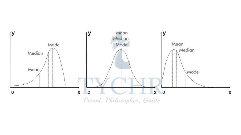
MEASURES OF VARIABILITY
Variability refers to how “spread out” a group of scores is. The terms variability, spread, and dispersion are synonyms, and refer to how spread out a distribution is. Just as in the section on central tendency where we discussed measures of the center of a distribution of scores, in this section we will discuss measures of the variability of a distribution which include the range, the variance, the standard deviation, the interquartile range and the coefficient of variance.
- RANGE
The range is simply the highest observation minus the lowest observation. What is the range of the following group of numbers: 10, 2, 5, 6, 7, 3, 4? Well, the highest number is 10, and the lowest number is 2, so 10 – 2 = 8. The range is 8.
Note that range does not take into account how the data is distributed, it is only affected by extreme values. - VARIANCE AND STANDARD DEVIATION
- Variance (Sn2)
Variability can also be defined in terms of how close the scores in the distribution are to the middle of the distribution. Using the mean as the measure of the middle of the distribution, the variance is defined as the average squared difference of the scores from the mean.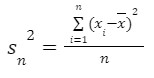 𝑥̅ is the sample mean, n is the size of population and xi are the values of the items in the sample.
 - Standard deviation (sn)
Because the differences are squared, the units of variance are not the same as the units of the data. Therefore, statisticians often find the standard deviation, which is the square root of the variance. The units of standard deviation are the same as those of the data set.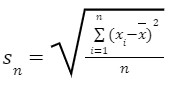 For data with approximately the same mean, the greater the spread, the greater the standard deviation.
- Variance (Sn2)
Ex. You and your friends have just measured the heights of your dogs (in millimeters):
The heights (at the shoulders) are: 600mm, 470mm, 170mm, 430mm and 300mm.
Find out the Mean, the Variance, and the Standard Deviation.
Mean = (600+470+170+430+300)/5
Mean =394
Now we calculate, each dog’s difference from the mean and square it.
Height of dog | |xi-x| | (xi-x)2 |
600 | 206 | 42436 |
470 | 76 | 5776 |
170 | 224 | 50176 |
430 | 36 | 1296 |
300 | 94 | 8836 |
Variance =Variance = (42436 + 5776 + 50176 + 1296 + 8836)/5
Variance =21704 mm2
Standard deviation =√21704
Standard deviation =147.32 mm
- THE INTERQUARTILE RANGE AND MEASURES OF NON-CENTRAL TENDENCY
- Percentiles and quartiles
Percentiles divide a data set into 100 equal parts. A percentile is simply a measure that tells us what percent of the total frequency of a data set was at or below that measure. The pth percentile of a distribution is the value such that p percent of the observations fall at or below it.
Ex. If on a test, a given test taker scored in the 60th percentile on the quantitative section, she scored at or better than 60% of the other test takers. Further, if a total of 500 students took the test, she scored at or better than (500)x(.60) = 300 students who took the test. This means that 200 students scored better than she did.
As the name suggests, quartiles break the data set into 4 equal parts.- The first quartile, Q1, is the 25th percentile.
- The second quartile, Q2, is the 50th percentile.
- The third quartile, Q3, is the 75th percentile.
- It’s important to note that the median is both the 50th percentile and the second quartile, Q2.
- Percentiles and quartiles
- Interquartile range
The interquartile range represents the central portion of the distribution, and is calculated as the difference between the third quartile and the first quartile. This range includes about one-half of the observations in the set, leaving one-quarter of the observations on each side.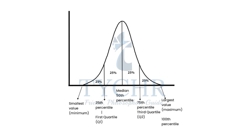
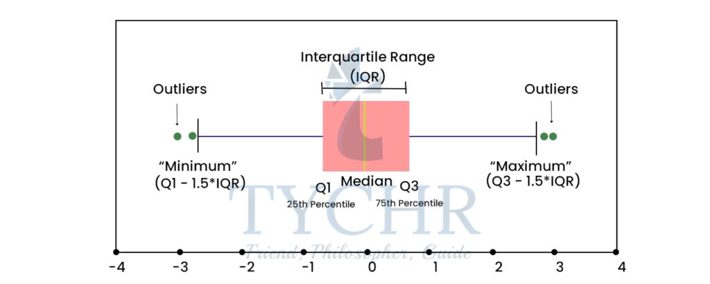
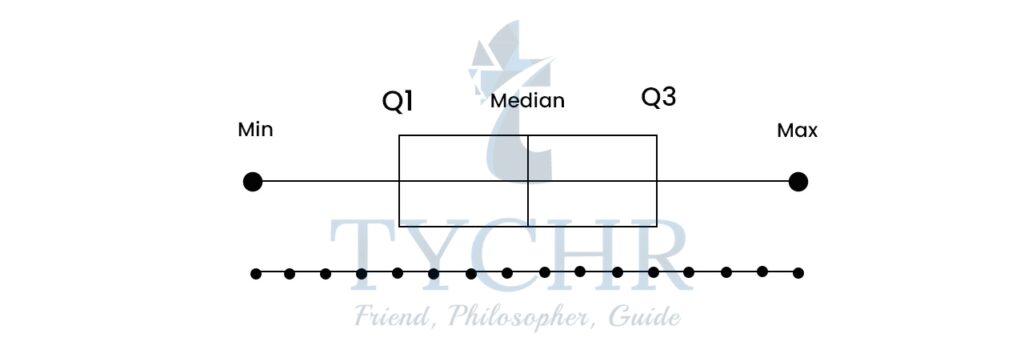
- Box-and-whisker plots
- A box and whisker plot, also called a box plot, displays the five-number summary of a set of data. The five-number summary is the minimum, first quartile, median, third quartile, and maximum.
- The lines extending parallel from the boxes are known as the “whiskers”, which are used to indicate variability outside the upper and lower quartiles.
- Outliers (points outside lower and uppe fences) are sometimes plotted as dotted lines that are in-line with whiskers.
- Box Plots can be drawn either vertically or horizontally.
Ex. A sample of 10 boxes of raisins has these weights (in grams): 25, 28, 29, 29, 30, 34, 35, 35, 37, 38
STEP 1: Arrange the data from smallest to largest and find the median. 25, 28, 29, 29, 30, 34, 35, 35, 37, 38
Median = (30+34 )/2 = 32
STEP 2: Find the quartiles
The first quartile is the median of the data points to the left of the median.
25, 28, 29,29,30
Q1=29
The third quartile is the median of the data points to the right of the median.
34, 35, 35, 37, 38
Q3=35
STEP 3: Complete the five-number summary by finding the minimum and the maximum.
Minimum- 25, Maximum- 38
The five number summary is 25, 29, 32, 35, 38
- Outliers formula:
Outlier <Q1-1.5(IQR)
Outlier >Q3+1.5(IQR)
(IQR-Interquartile range)
GROUPED DATA
Now, we extend the definitions of variance and standard deviation to data which has been grouped. An alternative, yet equivalent formula for variance, which is often easier to use is: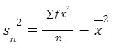 where, 𝑥̅ is the mean, f is the frequency with which the data value, x occurs. Note that ∑ 𝑓 =𝑛.
Ex. Find an estimate of the variance and standard deviation of the following data for the marks obtained in a test by 88 students.
Marks (x) | 0≤x<10 | 10≤x<20 | 20≤x<30 | 30≤x<40 | 40≤x<50 |
Frequency (f) | 6 | 16 | 24 | 25 | 17 |
We can show the calculations in a table as follows:
Marks | Mid Interval Value (x) | f | fx | x2 | fx2 |
0≤x<10 | 5 | 6 | 30 | 25 | 150 |
10≤x<20 | 15 | 16 | 240 | 225 | 3600 |
20≤x<30 | 25 | 24 | 600 | 625 | 15000 |
30≤x<40 | 35 | 25 | 875 | 1225 | 30625 |
40≤x<50 | 45 | 17 | 765 | 2025 | 34425 |
Total | 88 | 2510 | 83800 |
Mean = ∑ 𝑓x/𝑛 = 2510/88 = 28.52
Variance = (∑ 𝑓x2/𝑛) – x-2 = (83800/88) -(2510/88)2.
Variance =138.73
Standard deviation = √138.73 = 11.78
SHAPE, CENTRE AND SPREAD
A practical way of seeing the significance of the standard deviation can be demonstracted by empirical rule.
The empirical rule applies to a normal distribution. In a normal distribution, virtually all data falls within three standard deviations of the mean. The mean, mode, and median are all equal.
The empirical rule is also referred to as the Three Sigma Rule or the 68-95-99.7 Rule because:
- Within the first standard deviation from the mean, 68% of all data rests
- 95% of all the data will fall within two standard deviations
- Nearly all of the data – 99.7% – falls within three standard deviations (the .3% that remains is used to account for outliers, which exist in almost every dataset)
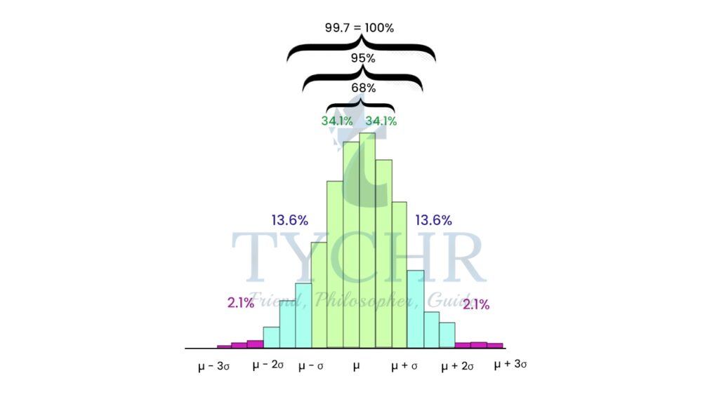
Here, is the mean and is the standard deviation.
LINEAR REGRESSION
BIVARIATE STATISTICS AND SCATTER DIAGRAM
Bivariate statistics is a type of inferential statistics that deals with the relationship between two variables. That is, bivariate statistics examines how one variable compares with another or how one variable influences another variable.
Ex. Ice cream sales versus the temperature on that day. The two variables are Ice Cream Sales and Temperature.
(If you have only one set of data, such as just Temperature, it is called “Univariate Data”)
One way to determine whether there is a relationship between two data sets is to plot the bivariate data on a scatter diagram. A scatter diagram takes the two sets of data and plots one set on the x-axis and the other set on the y-axis.
Look at the scatter diagram for the above example: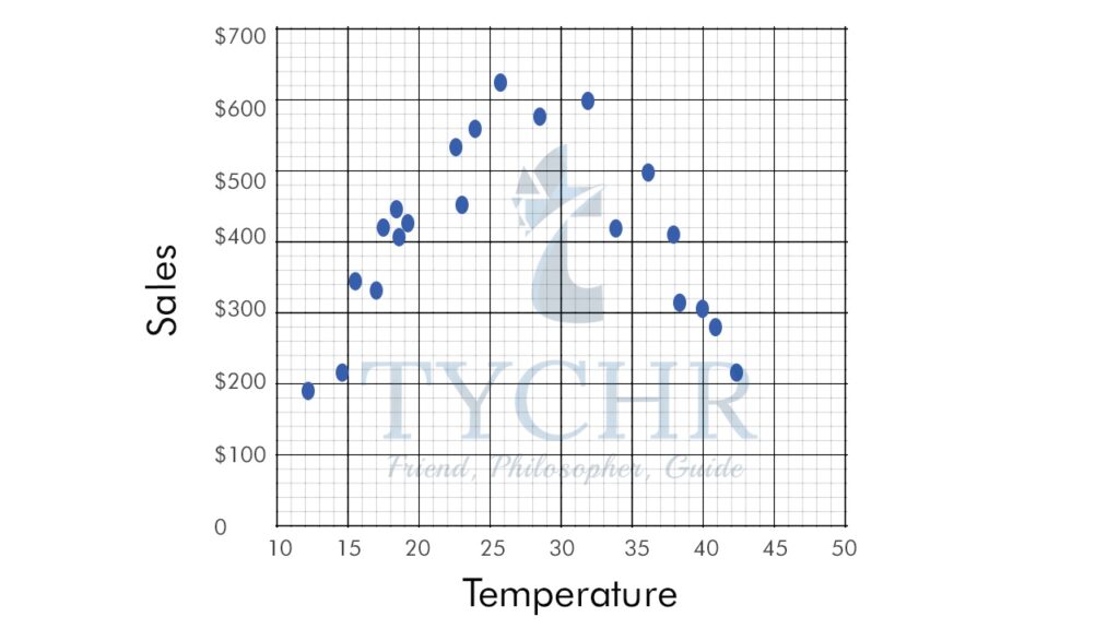
CORRELATION, COVARIANCE AND CAUSATION
- Correlation– A correlation exists between two variables, x and y, when a change in x corresponds to a change in y.
- The scatter diagram graphs pairs of numerical data, with one variable on each axis, to look for a relationship between them. If the variables are correlated, the points will fall along a line or curve.
- We say two linearly related variables are positively associated if an increase in one causes an increase in the other.
- We say two linearly related variables are negatively associated if an increase in one causes a decrease in the other (second “Linear” image).
- A scatter diagram not only shows you whether the correlation between two variables is positive or negative, but also tells you something about the strength of the correlation. The better the correlation, the tighter the points will hug the line.
- In the diagrams above the 1st one in each case is a strong correlation, 2nd one is a moderate correlation and the 3rd is a weak correlation.
- Some correlations will be linear (the scatter graph will follow a straight line) and other correlations will be non-linear (the scatter graph will follow a curve, or other non-linear relationship).
- Covariance- Covariance provides a measure of the strength of the correlation between two or more sets of random variates. The covariance for two random variates X and Y, with means x and y, each with sample size N, is defined by:
𝒄𝒐𝒗(𝑿, 𝒀) = 𝑬(𝑿 − 𝝁𝒙 )(𝒀 − 𝝁𝒚) = 𝑬(𝑿𝒀) − 𝝁𝒙𝝁y
The above result leads to:
𝑐𝑜𝑣(𝑋, 𝑋) = 𝐸(𝑋𝑋) − 𝜇𝑥𝜇𝑥 = 𝐸(𝑋2) − 𝜇𝑥2- If X and Y are not independent, then 𝑉(𝑋 + 𝑌) = 𝑉(𝑋) + 2𝑐𝑜𝑣(𝑋, 𝑌) + 𝑉(𝑌)
- If X and Y are independent, then 𝑐𝑜𝑣(𝑋, 𝑌) = 𝐸(𝑋𝑌) − 𝜇𝑥𝜇𝑦 = 0
and consequently 𝑉(𝑋 + 𝑌) = 𝑉(𝑋) + 𝑉(𝑌) - Correlation coefficient 𝜌𝑋𝑌 = 𝑐𝑜𝑣(𝑋,𝑌)/𝜎𝑋𝜎Y
- If X and Y are not independent, then 𝑉(𝑋 + 𝑌) = 𝑉(𝑋) + 2𝑐𝑜𝑣(𝑋, 𝑌) + 𝑉(𝑌)
- Causation- A correlation between two data sets does not necessarily mean that change in one variable causes change in the other. Causation indicates a relationship between two events where one event is affected by the other. When the value of one event, or variable, increases or decreases as a result of other events, it is said there is causation.
- Measuring correlaton- Soemetimes it is difficult to make judgements about the strength of a correlation by means of a scatter plot.
Therefore, we need to represent the strength of a correlation as a numerical value.- The Pearson product-moment correlation coefficient (denoted by r, where -1<r<1), is a measure of the correlation strength between two variables x and y. It is commonly used as a measure of the strength of linear correlation between two variables. It has no unit.
 where, x and y are the means of the variables and sx and sy are the standard deviations.
 - A correlation coefficien of -1 shows a perfect negative correlation, while a correlation coefficient of 1 shows a perfect positive correlation. A correlation coefficient of 0 shows no linear relationship between the two variables.
- A stronger relationship between the two variables is shown by the r-value being closer to either +1 or -1, depending on whether the relationship is positive or negative.
- The Pearson product-moment correlation coefficient (denoted by r, where -1<r<1), is a measure of the correlation strength between two variables x and y. It is commonly used as a measure of the strength of linear correlation between two variables. It has no unit.
Ex. The local ice cream shop keeps track of how much ice cream they sell versus the temperature on that day, here are their figures for the last 12 days:
Temperature | Ice cream sales |
14.20 | $215 |
16.40 | $325 |
11.90 | $185 |
15.20 | $332 |
18.50 | $406 |
22.10 | $522 |
19.40 | $412 |
25.10 | $614 |
23.40 | $544 |
18.10 | $421 |
22.60 | $445 |
17.20 | $408 |
Plot a scatter plot and find the correlation coefficient.
Scatter plot:
We can see that warmer weather and higher sales go together. The relationship is good but not perfectly linear.
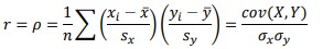
Temp(0C) (x) | Sales(y) | 𝑥i-𝑥̅ | 𝒚i-𝒚̅ | (𝑥i-𝑥̅)(𝒚i-𝒚̅) | (𝑥i-𝑥̅ )2 | (𝒚i-𝒚̅)2 |
14.20 | $215 | -4.5 | -187 | 842 | 20.3 | 34969 |
16.40 | $325 | -2.3 | -77 | 177 | 5.3 | 5929 |
11.90 | $185 | -6.8 | -217 | 1476 | 46.2 | 47089 |
15.20 | $332 | -3.5 | -70 | 245 | 12.3 | 4900 |
18.50 | $406 | -0.2 | 4 | -1 | 0.0 | 16 |
22.10 | $522 | 3.4 | 120 | 408 | 11.6 | 14400 |
19.40 | $412 | 0.7 | 10 | 7 | 0.5 | 100 |
25.10 | $614 | 6.4 | 212 | 1357 | 41.0 | 44944 |
23.40 | $544 | 4.7 | 142 | 667 | 22.1 | 20164 |
18.10 | $421 | -0.6 | 19 | -11 | 0.4 | 361 |
22.60 | $445 | 3.9 | 43 | 168 | 15.2 | 1849 |
17.20 | $408 | -1.5 | 6 | -9 | 2.3 | 36 |
Total | 5325 | 177 | 174757 |
Which shows that the correlation is strong but not perfect.
THE LINE OF BEST FIT (REGRESSION LINE)
A line of best fit can be roughly determined using an eyeball method by drawing a straight line on a scatter plot so that the number of points above the line and below the line is about equal (and the line passes through as many points as possible).
Drawing the line of best fit for the previous example of ice cream sale and temperature;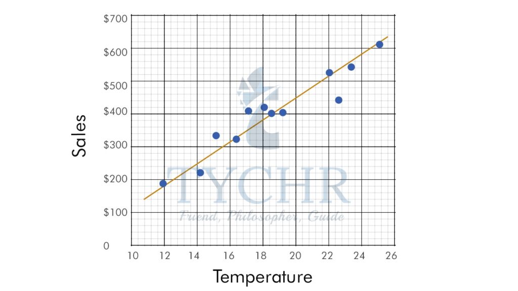
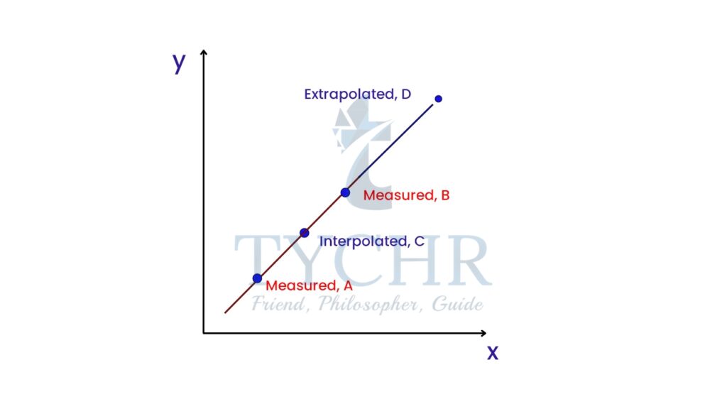
INTERPOLATION AND EXTRAPOLATION
Interpolation- We could use our function to predict the value of the dependent variable for an independent variable that is in the midst of our data. In this case, we are performing interpolation. It is reasonable when the scatter plot shows a strong relationship.
Extrapolation- We could use our function to predict the value of the dependent variable for an independent variable that is outside the range of our data. In this case, we are performing extrapolation. It is extremely suspect. Without data in the range, there is no reason to believe that the relationship between X and Y is the same as in the region in which there is data.
LEAST SQUARE REGRESSION
- There can be multiple regression lines for a scatter plot.
- A residual if the vertical distance between a data point and the graph of a regression line.
- The least square regression line has the smallest possible value for the sum of the squares of the residuals.
- A regression line must pass through the point (𝑥̅ ,𝒚̅).
- Slope of least square regression line- 𝑏 = 𝑐𝑜𝑣(𝑋,𝑌)/𝑉(𝑋) = (∑(𝑥𝑖−𝑥̅)(𝑦𝑖−𝑦̅))/( ∑(𝑥𝑖−𝑥̅)2 )= 𝑟(𝑠𝑦/𝑠𝑥)
- The intercept of least square regression line- a = 𝑦̅ – b𝑥̅
Ex. Draw a least square regression line for the following data:
Hours spent on essay | Grade |
6 | 82 |
10 | 88 |
2 | 56 |
4 | 64 |
6 | 77 |
7 | 92 |
0 | 23 |
1 | 41 |
8 | 80 |
5 | 59 |
3 | 47 |
Scatter plot: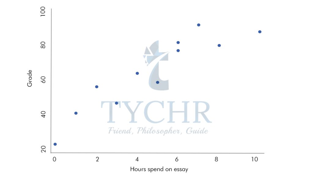
Mean of hours spent =4.72
Mean of grade=64.45
Hours spent on essay (𝑥) | Grade(𝑦) | 𝑥i-𝒚̅ | (𝑦̅i-𝑥̅) | (𝑥i-𝑥̅)(𝑦i-𝑦̅ ) | 𝑥i-𝑥2 |
6 | 82 | 1.27 | 17.55 | 23.33 | 1.6129 |
10 | 88 | 5.27 | 23.55 | 124.15 | 27.772 |
2 | 56 | -2.73 | -8.45 | 23.06 | 7.452 |
4 | 64 | -0.73 | -0.45 | 0.33 | 0.532 |
6 | 77 | 1.27 | 12.55 | 15.97 | 1.612 |
7 | 92 | 2.27 | 27.55 | 62.60 | 5.152 |
0 | 23 | -4.73 | -41.45 | 195.97 | 22.372 |
1 | 41 | -3.73 | -23.45 | 87.42 | 13.91 |
8 | 80 | 3.27 | 15.55 | 50.88 | 10.69 |
5 | 59 | 0.27 | -5.45 | -1.49 | 0.072 |
3 | 47 | -1.73 | -17.45 | 30.15 | 2.992 |
Total | 611.36 | 94.18 |
𝑏 = ∑(𝑥𝑖−𝑥̅)(𝑦𝑖−𝑦̅) /∑(𝑥𝑖−𝑥̅)2
b = (611.36)/(94.18)
b = 6.49a
a=𝒚̅-b𝑥̅
a=64.45-6.49(4.72)
a=30.18
We have the slope and the intercept of the equation, therefore, the equation will be-
y=6.49x+30.18
Now, drawing the least square regression line on the scatter plot.
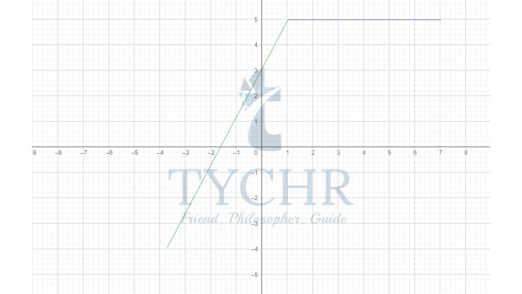
PIECEWISE LINEAR FUNCTIONS
In reality, a single linear function might not be sufficient to model a scenario. In this case, a different function could be used to model each section . Combining two or more linear functions results in what is called a piecewise linear function.
Ex. 𝑓(𝑥) = { 2𝑥 + 3, − 3 ≤ 𝑥 < 1 5, 1 ≤ 𝑥 ≤ 6