By the end of this chapter you should be familiar with:
- Population and Bias
- All about sampling
- Outliers
- Discrete and continuous data
- Histograms
- Box and whisker plots
- Cumulative frequency graph
- Measures of central tendency and dispersion
- Skewness, scatter graphs and correlation
COLLECTING AND ORGANIZING DATA
Qualitative data is non-numerical. Quantitaive data is numerical.
- Discrete
- Continuous
Discrete data takes specific values and continuous data can take a full range of values.
A population includes all members of a defined group.
A sample is a subset of the population i.e., a selection of individuals from the population.
Biased sampling is where the method may cause you to draw misleading conclusions about the population.
Simple random sampling is where every member of the population is equally likely to be chosen.
For example, in an organization of 500 employees, if the HR team decides on conducting team building activities, it is highly likely that they would prefer picking chits out of a bowl. In this case, each of the 500 employees has an equal opportunity of being selected.
Systematic sampling: find a sample of size N by selecting every kth member where k = N/n to the nearest whole number.
For example, a researcher intends to collect a systematic sample of 500 people in a population of 5000. He/she numbers each element of the population from 1-5000 and will choose every 10th individual to be a part of the sample (Total population/ Sample Size = 5000/500 = 10).
Stratified sampling is selecting a random sample where number in certain categories are propoertional to the number in the population.
For example, a researcher looking to analyse the characteristics of people belonging to different annual income divisions will create strata (groups) according to the annual family income. Eg: less than $20,000, $21,000 to $30,000, $31,000 to $40,000, $41,000 to $50,000, etc. By doing this, the researcher concludes the characteristics of people belonging to different income groups. Marketers can analyse which income groups to target and which ones to eliminate to create a roadmap that would bear fruitful results.
Quota sampling decides how many members of each group you want to sample and takes sample from the population until you have a large enough sample for each group.
Convenience sampling takes samples from the members of the population that you have access to until you have a sample of the desired size.
For example, start-ups and NGOs usually conduct convenience sampling at a mall to distribute leaflets of upcoming events or promotion of a cause – they do that by standing at the mall entrance and giving out pamphlets randomly.
STATISTICAL MEASURES
The most common measurements of the central tendency are mean, median and mode.
The mode of a data set is the value that occurs most frequently. There can be no mode, one mode or several modes.
The median of a data set is the value that lies in the middle when the data are arranged in size. If there are two values we take the mid-point of those points.
The mean of a data set is the sum of all the values divided by the number of values.
Example: 9 people take a test. Their scores out of 100 are: 56, 79, 77, 48, 90, 68, 79, 92, 71
Solution: Rearranging we get: 48, 56, 68, 71, 77, 79, 79, 90, 92
Mean == (56 + 79 + 77+ 48+ 90 + 68 + 79 + 92 + 71)/9 = 73.3
Median = 77 (the middle value)
Mode = 79 as it’s repeated most number of times
MEASURES OF DISPERSION
Measures of dispersion measure how spread out a data set is. The most common measure of dispersion is range.
Range is found by subtracting the smallest number from the largest number.
Standard deviation gives an idea how the values are related to the mean.
Variance is given by 𝜎2
Quartiles in statistics are values that divide your data into quarters.
The upper quartile Q3 is the number dividing the third and fourth quartile. The upper quartile can also be thought of as the median of the upper half of the numbers.
The lower quartile Q1 is the median data point of the lower half of the data.
The interquartile range IQR is the difference between the upper quartile and the lower quartile.
An outlier is defined as the data item that is more than 1.5 × IQR below Q1 or above Q2 (the semi quartile).
If the data is continuous then you find estimates for the quantities you are trying to find.
Example: A year ago, Angela began working at a computer store. Her supervisor asked her to keep a record of the number of sales she made each month.
The following data set is a list of her sales for the last 12 months: 34, 47, 1, 15, 57, 24, 20, 11, 19, 50, 28, 37.
Use Angela’s sales records to find:
- the median
- the range
- the upper and lower quartiles
- the interquartile range
Solution:
- The values in ascending order are:
1, 11, 15, 19, 20, 24, 28, 34, 37, 47, 50, 57.Median = (12th + first) ÷ 2
= 6.5th value
= (sixth + seventh observations) ÷ 2
= (24 + 28) ÷ 2
= 26 - Range = difference between the highest and lowest values = 57 – 1 = 56
- Lower quartile = value of middle of first half of data Q1
= the median of 1, 11, 15, 19, 20, 24
= (third + fourth observations) ÷ 2
= (15 + 19) ÷ 2
= 17
Upper quartile = value of middle of second half of data Q3
= the median of 28, 34, 37, 47, 50, 57
= (third + fourth observations) ÷ 2
= (37 + 47) ÷ 2
= 42 - Interquartile range = Q3–Q1
= 42 – 17
= 25
WAYS TO PRESENT YOUR DATA
FREQUENCY HISTOGRAMS
A histogram is very similar to bar chart but bar charts are used for graphing qualitative data and histograms are used for quantitative data.
Example: The frequency histogram for this data which contains different ages is
36 | 25 | 38 | 46 | 55 | 68 | 72 | 55 | 36 | 38 |
67 | 45 | 22 | 48 | 91 | 46 | 52 | 61 | 58 | 55 |

BOX AND WHISKER DIAGRAMS
A box and whisker plot—also called a box plot—displays the five-number summary of a set of data. The five-number summary is the minimum, first quartile, median, third quartile, and maximum.

In a box plot, we draw a box from the first quartile to the third quartile. A vertical line goes through the box at the median. The whiskers go from each quartile to the minimum or maximum.

Example: A sample of 10 boxes of raisins has these weights (in grams): 25, 28, 29, 29, 30, 34, 35, 35, 37, 38
Solution: Our data is already in order.
25, 28, 29, 29, 30, 34, 35, 35, 37, 38
Median = (30 + 34)/2 = 32
The first quartile is the median of the data points to the left of the median. Q1 = 29
The third quartile is the median of the data points to the right of the median. Q3 = 35
Min is the smallest data point, which is 25.
Max is the largest data point, which is 38.
The five-number summary is 25, 29, 32, 35, 38.

CUMULATIVE FREQUENCY
The cumulative frequency of a set of data or class intervals of a frequency table is the sum of the frequencies of the data up to a required level. It can be used to determine the number of items that have values below a particular level.
Example: Lets consider this table and find the cumulative frequency and plot it.
Marks | Frequency | Cumulative frequency |
0 ≤ x < 10 | 5 | 5 |
10 ≤ x < 20 | 19 | 5 + 19 =24 |
20 ≤ x < 30 | 30 | 24 + 30 = 54 |
30 ≤ x < 40 | 20 | 54 + 20 = 74 |
40 ≤ x < 50 | 6 | 74 + 6 =80 |
Median = 21.4
Q1 = 17.1, Q3 = 25.2
IQR = 25.2 – 17.1 = 8.1
BIVARIATE DATA
Bivariate data has two variables and univariate data has one variable. With bivariate data you have two sets of data that you want to compare to see if there is any correlation between the two sets.
TYPES OF CORRELATION
If we have data items x1, x2,….xn associated with data items y1, y2,….yn then we can draw scatter diagram by plotting the pairs (x1, y1),…….(xn, yn)

Correlation does not imply causation.
A line of best fit can be drawn on a scatter diagram by plotting the point ( and drawing a line through the point.
If the gradient of the line is positive then we say that the data has a positive correlation and if its negative the data has a negative correlation.
The strength of correlation is determined by how close the points are.
PMCC can be calculated using technology and takes values between -1 to 1. r = 1 indictaes perfect positive correlation, whereas r = -1 indicates perfect negative correlation and r = 0 indicated no correlation.
Ice Cream Sales vs Temperature | |
Temperature °C | Ice Cream Sales |
14.2° | $215 |
16.4° | $325 |
11.9° | $185 |
15.2° | $332 |
18.5° | $406 |
22.1° | $522 |
19.4° | $412 |
25.1° | $614 |
23.4° | $544 |
18.1° | $421 |
22.6° | $445 |
17.2° | $408 |
Example: An ice cream shop keeps track of how much ice cream they sell versus the temperature on that day. Here are their figures for the last 12 days:
Solution: The correlation is 0.9575. You can either use the calculator or use this formula 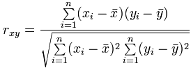
The line of best fit is:
In the previous chapter we defined interpolation and extrapolation, here we’ll see how it’s used.
Interpolation is where we find a value inside our set of data points.
Here we use linear interpolation to estimate the sales at 21 °C.
Extrapolation is where we find a value outside our set of data points.
Here we use linear extrapolation to estimate the sales at 29 °C.
